Kadence | Mobile Menu
The off-canvas mobile menu is one of Kadence’s most powerful features. It allows your menu to slide in smoothly from the side of the screen, creating a clean and modern mobile experience—exactly what Rakshi Creations themes are designed for.
In this tutorial, you’ll learn how to fully customize the Kadence off-canvas mobile menu using the WordPress Customizer so it matches your theme demo perfectly.
What Is an Off-Canvas Mobile Menu?
An off-canvas menu is a hidden menu panel that appears when users tap the hamburger (menu) icon on mobile devices. Instead of pushing content down, the menu slides in from the left or right side of the screen.
Kadence uses an off-canvas system for mobile navigation, giving you full control over:
- Slide direction
- Background colors
- Typography
- Spacing
- Buttons and widgets inside the menu
Before You Start
Make sure:
- Kadence Theme is active
- Your Rakshi Creations theme demo is imported
- A menu is assigned to Primary Navigation
💡 We strongly recommend editing mobile menus using the mobile preview inside the Customizer.
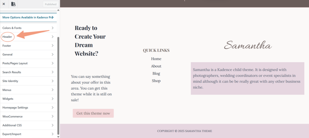
Step 1: Open the Kadence Customizer
- Go to Dashboard → Appearance → Customize
- You are now inside the Kadence Customizer
- Click on the Header Tab
Step 2: Switch to Mobile View
- At the bottom of the Customizer, click the mobile device icon 📱
- This ensures you’re editing the correct layout
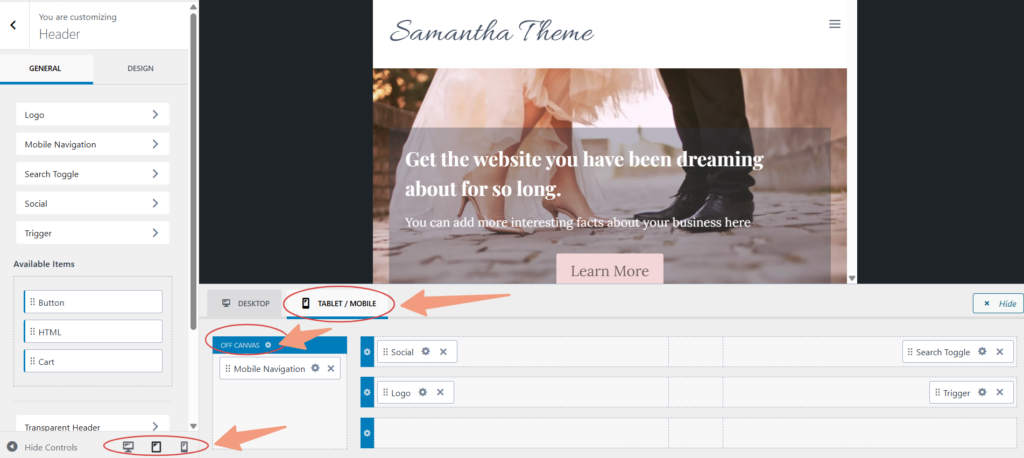
Step 3: Access the Off-Canvas Mobile Menu Settings
In the Customizer, navigate to:
Header → Tablet/Mobile tab shown in the screenshot above.
This section controls the off-canvas menu panel—Mobile Navigation Gear Icon. You can customize your mobile navigation menu by clicking on the “General” and “Design” tabs on the left side.
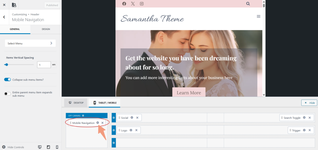
Step 4: Choose the Off-Canvas Slide Direction
Under Mobile Navigation Settings, you’ll see the option to control how the menu opens.
You can set:
- Slide from Left (most common)
- Slide from Right
Step 5: Customize the Off-Canvas Background
Go to:
Header → Mobile Navigation → Design
Here you can customize the panel background:
- Solid color background
- Neutral tones (recommended)
- Light backgrounds for feminine designs
Recommended demo style:
- Soft neutral or white background
- Avoid very dark backgrounds unless your branding requires it
Step 6: Adjust Padding and Spacing
Still under Design, scroll to padding and spacing options.
You can control:
- Top and bottom padding
- Side spacing
- Overall breathing room inside the menu
💡 Proper spacing is key to achieving a clean, designer look on mobile.
Step 7: Customize Mobile Menu Typography
Navigate to:
Header → Mobile Navigation → Menu Typography
Here you can:
- Change font family
- Adjust font size for mobile
- Control line height
- Set text color
Recommended styling:
- Slightly larger font size for readability
- Neutral or soft dark text colors
Step 8: Style Menu Item Hover & Active States
Inside Design, you can also control:
- Hover color
- Active link color
This helps users understand which page they’re on.
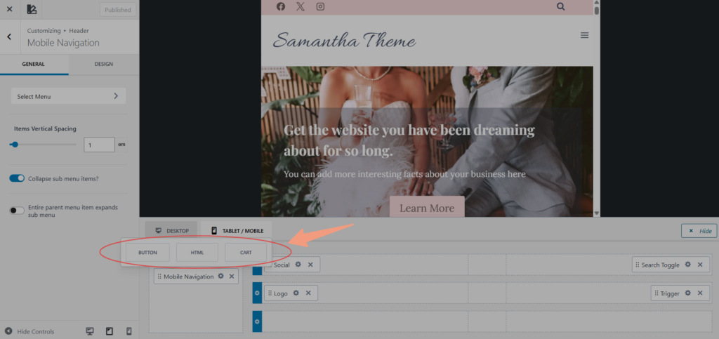
Step 9: Add Extra Elements Inside the Off-Canvas Menu (Optional)
Kadence allows you to add more than just menu links.
From the Mobile Header Builder, you can add:
- Buttons (Shop / Contact / Freebie)
- Social icons
- Search bar
These elements appear inside the off-canvas panel.
Step 10: Close Icon & Accessibility Settings
Kadence automatically includes a close (X) icon in the off-canvas menu.
You can:
- Adjust its color
- Ensure contrast for accessibility
Step 11: Publish and Test
- Click Publish
- Test the menu on:
- Real mobile device
- Different screen sizes
📸 Screenshot here: Publish button highlighted
Common Off-Canvas Mobile Menu Issues
❌ Menu does not open
- Ensure Navigation Toggle is added to the Mobile Header
- Confirm a menu is assigned to Primary Navigation
❌ Menu looks different from the demo
- Make sure you’re editing in mobile view
- Recheck background and typography settings
❌ Menu feels cramped
- Increase padding under Mobile Navigation → Design
The Kadence off-canvas mobile menu gives you full creative control while keeping your site fast and user-friendly. With thoughtful spacing, clean typography, and soft colors, you can achieve a polished mobile experience that looks custom-designed.